
Unbiased headlines. Facts, not spin.
Every story is an unbiased news briefing written from 110+ sources across the spectrum — sources linked so you can verify it yourself.
 economy
Notable (6/10)
July 8, 2026 at 11:45 AM
economy
Notable (6/10)
July 8, 2026 at 11:45 AM
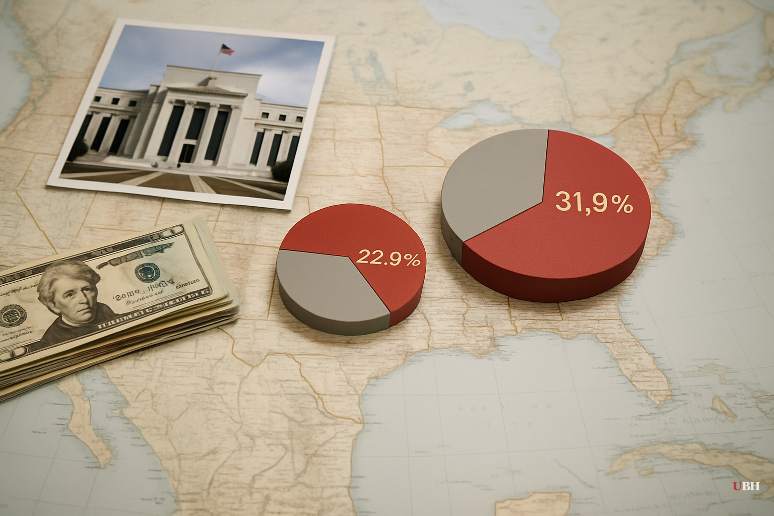
Federal Reserve Data: The Top 1% Now Holds 31.9% of U.S. Household Wealth, Up from 22.8% in 1989
What the Fed's Numbers Actually Show
The Federal Reserve's Distributional Financial Accounts track U.S. household wealth from Q3 1989 through Q4 2025. The picture they paint is consistent across every market cycle: wealth has concentrated upward, and it has done so primarily because different groups own fundamentally different things.
The top 1%'s share of total household wealth climbed from 22.8% in 1989 to 31.9% by Q4 2025, according to that Fed data as reported by Visual Capitalist's Boyan Girginov. Within that group, the top 0.1% alone went from 8.6% to 14.5% over the same period.
Every other wealth tier lost share. Every single one.
The Asset Mix Is the Whole Explanation
The top 1% built wealth primarily through stocks and privately held businesses — assets that have soared in value for decades. Real estate, the dominant asset for households in the middle, appreciated far more slowly than the stock market over the period.
For the bottom 50%, the picture is worse. Much of that group's net worth is home equity. Many households in it have little or no net worth at all. The 2008 housing crash demonstrated exactly how exposed that position is. The bottom 50%'s share of national household wealth fell to a record low of 0.4% during that crisis before recovering to 2.5% as of Q4 2025.
A 2.5% share split across half the U.S. population is a thin margin.
The Group That Lost the Most Ground
The headline about billionaires captures attention, but the largest proportional loss belongs to a less-discussed group: households between the 50th and 90th percentiles, what the Fed data classifies as the upper-middle 40%. Their collective share of national wealth slid from 35.7% in 1989 to 29.2% by 2025.
These are households most people would describe as solidly middle-class and upper-middle-class: teachers, small business owners, mid-career professionals. Their wealth is heavily weighted toward home values and defined-contribution retirement accounts. They benefited from the post-2009 equity recovery but not at the rate of households with larger stock portfolios.
Even the next 9% — households between the 90th and 99th percentiles — slipped from 38.0% to 36.4%. The concentration isn't just pulling away from the bottom. It's pulling away from nearly everyone.
The Strongest Counter-Argument
Critics of wealth-concentration narratives make a fair point: rising inequality in share of wealth does not automatically mean the bottom is worse off in absolute terms. A larger slice of a much larger pie can still represent more actual purchasing power. The U.S. economy grew substantially from 1989 to 2025, and even the bottom 50%'s nominal net worth may have increased in dollar terms, even if their proportional share shrank.
There is also a structural argument: the stock market boom disproportionately rewarded early investors and entrepreneurs who took real risks. Rewarding risk-taking is how a market economy is supposed to work.
Both points have merit. But they don't fully address what the data shows. The bottom 50% holding 2.5% of total national household wealth means that group has almost no financial cushion for emergencies, recessions, or retirement. Absolute improvement at the margins doesn't change the fragility of that position.
Market Cycles Accelerate the Gap
The Fed data also reveals how market swings interact with wealth stratification. Every equity bull market disproportionately rewards those with the largest financial asset holdings. Every bust hits hardest those with the least diversification and the thinnest reserves.
The 2008 housing crash was a vivid case study. It erased the primary asset of ordinary households while financially diversified households — those with stocks, bonds, and cash — eventually recovered faster once equity markets rebounded. The 2020 COVID crash followed a similar pattern on a compressed timeline. Stocks recovered within months. The economic fallout for low-wage service workers lasted far longer.
This dynamic compounds over decades. Gains build on prior gains. Losses interrupt compounding at the worst possible time.
The Open Question
The Federal Reserve data describes a structural outcome but does not, by itself, prescribe a remedy. The legitimate debate is over why this happened and what, if anything, should change.
One school points to tax policy, specifically the preferential treatment of capital gains relative to wage income, as a deliberate accelerant. Another argues that restricting capital formation would slow the very growth that generated wealth for everyone, including the bottom. A third position focuses on the erosion of financial literacy and retirement savings access among lower-income households.
All three are grounded in real evidence. None has a clean answer. What the Fed's 36-year record does establish is the direction: wealth has moved upward at every measurement point, through Republican and Democratic administrations alike, through rate hikes and rate cuts, through booms and crashes. Whether that trajectory is a feature of the system or a flaw in it is the question policymakers have failed to resolve across four decades.
Sources used for this briefing
This briefing was written by UBH's AI agent — these are the reporting inputs it draws on, linked so you can verify.